Flowtonik
An AI-assisted DAW for Mac. Studio-grade mixing and mastering in one click. You stay in control of every decision.
- Client
- Stems Labs
- Role
- Design and engineering
- Year
- 2025–2026
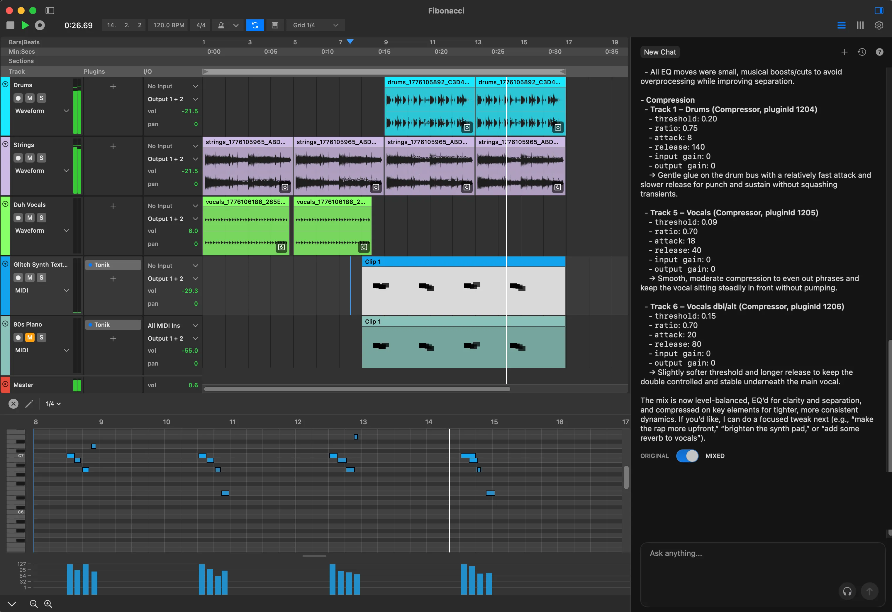
The premise
A traditional DAW gives you every control and no opinion; you already need to know which band to cut and by how much. AI music tools invert that: a finished sound with no way in. Flowtonik is a full DAW for Mac that sits between the two, with a conversational assistant that works on your session in the open.
Designing through implementation
Flowtonik had relatively little detailed design direction, so design and engineering happened in parallel rather than as separate phases. The process was roughly: rough idea → design → implement → use the actual product → discover friction → redesign → rebuild.
I treated implementation as a design tool. Static designs could not reveal interaction timing, friction, hierarchy, attention, or whether something felt natural in the context of making music. I could not tell whether an interaction worked until I used it in the actual workflow, so I built early and let the running product challenge the design.
A familiar foundation
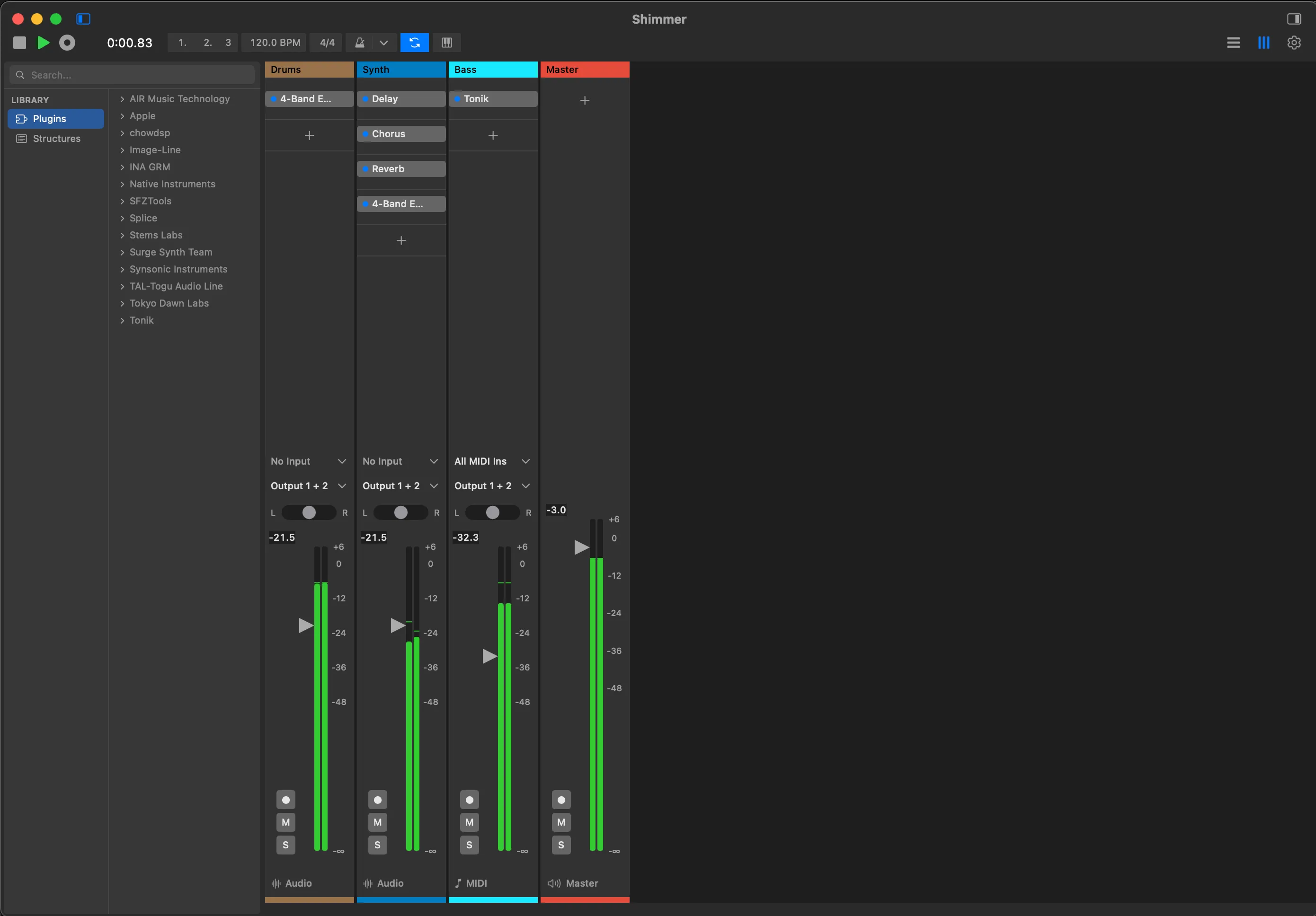
Flowtonik has two main screens. Edit is the arrangement, where clips sit on a timeline; Mix is the channel strips. Both look the way forty years of DAWs have taught people to expect, tracks and waveforms here, faders and meters there, because the novelty budget is spent on the AI interaction.
Preserving those mental models lets the assistant introduce new behaviour without making the entire product unfamiliar. The contrast is deliberate: familiar DAW foundation, novel AI interaction.
Why chat?
The models were improving quickly, so an interface designed around their current limitations would age with them. We intentionally kept the primary AI interaction in chat. It is a flexible surface that can support more capable models without requiring a fundamental redesign or scattering bespoke AI controls throughout the DAW too early.
The tradeoff was real: the assistant could feel somewhat bolted on. That was a better compromise than pretending it was another DAW control. It was designed as a companion alongside the workspace, with room to change as the technology changed.
The important distinction is that the AI interaction was separate, but its actions were not:
Chat → AI understands intent → AI modifies actual DAW state → the user continues with familiar DAW controls
Prompts stay short because context is assembled automatically. Each request carries the state of the timeline, the selected track or clip, and recent actions, which together are a useful proxy for attention. “Add some reverb” lands on the track you are holding instead of starting an interrogation. The chat does not have to look like the DAW because it already operates within the DAW’s state.
AI actions and the trust problem
Giving an AI control of the session is where the harder design problem begins: how do you let it modify a professional user’s work without turning the result into a black box?
When the assistant mixes, it does not return a rendered file or an abstract recommendation. It places real plugins on real tracks, with real parameters, in the same slots the user would choose. Every move can be inspected, edited, automated, or undone. The AI can do meaningful work, but the result remains part of the user’s existing workflow.
The Original / Mixed toggle makes disagreement cheap. A user can hear both states immediately, inspect what changed, then continue from whichever point they choose. Control, transparency, and reversibility are not explanations added around the AI. They are properties of the working interaction.
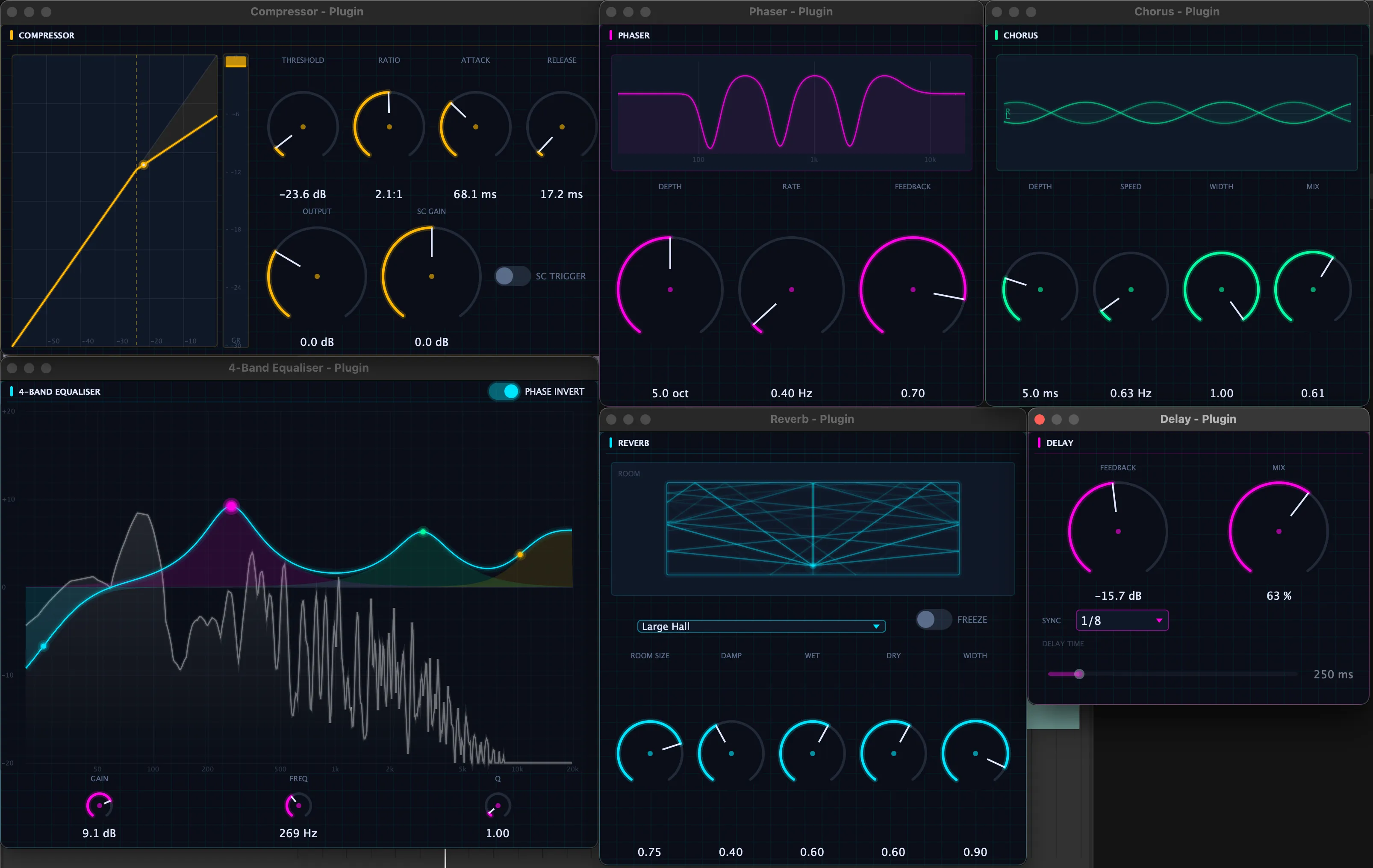
Flowtonik also hosts user-installed Audio Units and VSTs, so its built-in suite is a starting point rather than a wall. The conversation lands as session state, and that state belongs to the user.
What implementation revealed
One workspace was not one task
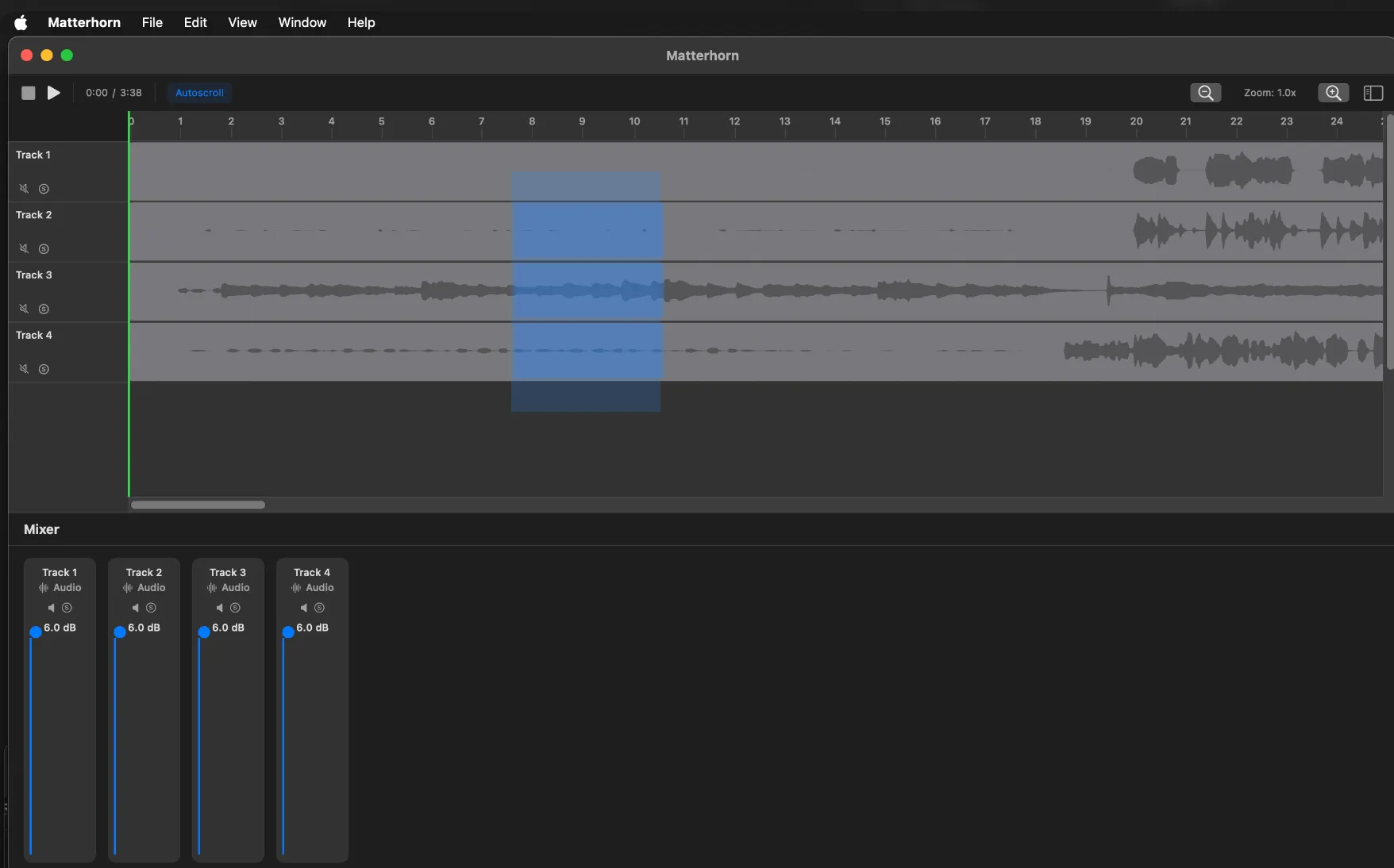
Initial hypothesis. Keeping arrangement and mixing controls in one window would make moving between them feel immediate.
What I learned. Once I used the build with real sessions, the layout made both tasks smaller without making either clearer. Arrangement work wants horizontal timeline space. Mixing wants tall, information-dense channel strips. The split also left a large inactive region beside the early mixer.
What changed. Edit and Mix became separate, familiar views that preserve track order and colour between them. The final design adds a mode change, but each mode can use the full workspace for the task it supports.
A prompt was not enough feedback
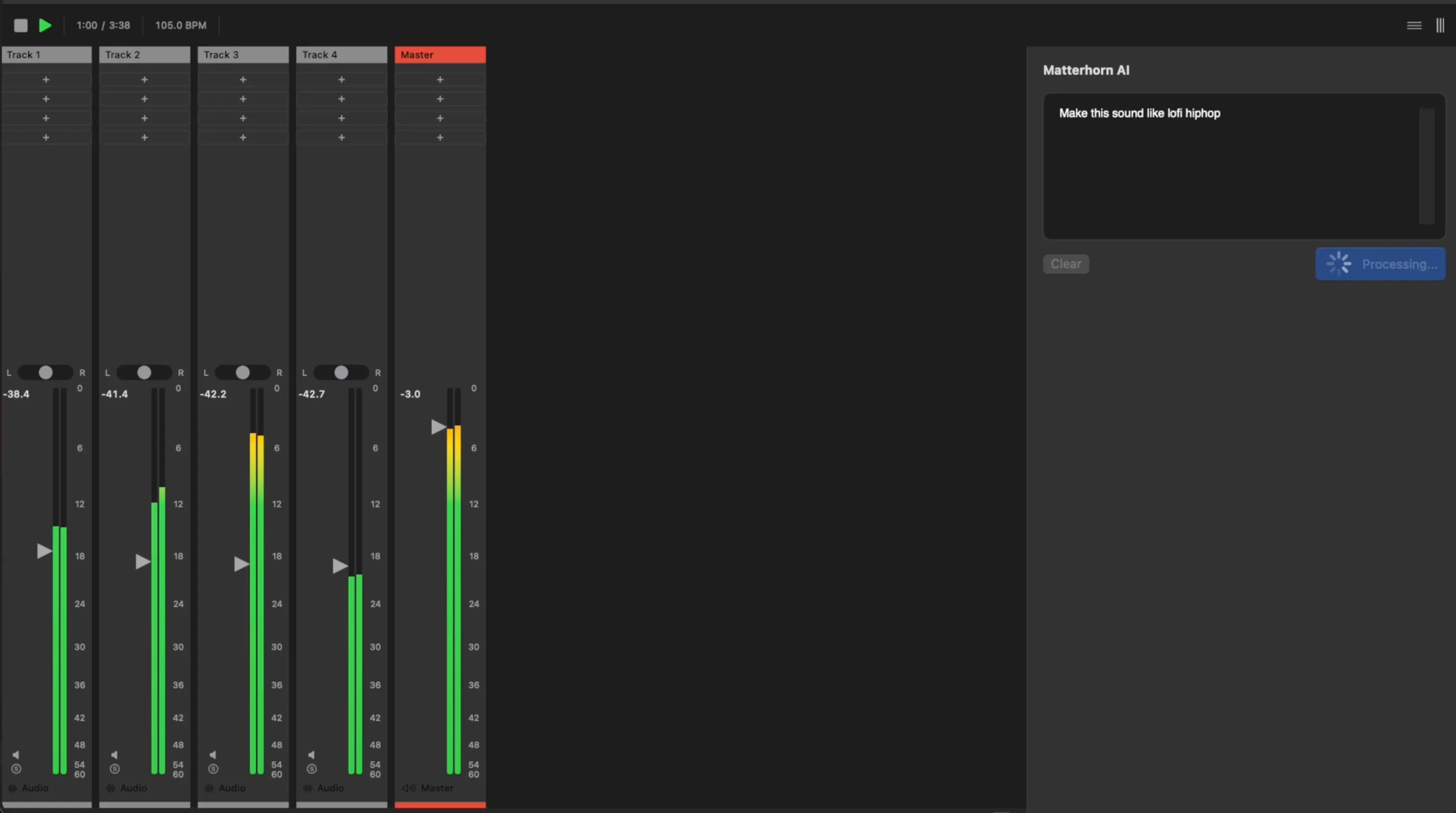
Initial hypothesis. A persistent prompt area and processing state would be enough to make the assistant understandable while it worked.
What I learned. The implemented version exposed a trust gap. The user could see what they asked for and that something was happening, but not what changed, where it changed, or how to compare the result with the original.
What changed. The final assistant reports the operations it performed, then pairs the result with Original / Mixed comparison. Because those operations create normal plugin and parameter state, the user can audit the response and keep editing it with the same controls as any other session change.
A system that stays legible while dense
The visual-system question was not how to make a dense professional application prettier. It was how to make it easier to understand without adding more visual noise.
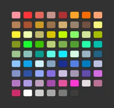
A track’s colour is its identity. Set once, it follows the audio through the arrangement, mixer, and piano roll, making recognition faster than reading. Structural chrome stays on a neutral grey ramp. Saturated colours carry semantic meaning, while blue marks selection and places where the system is acting. Consistent visual semantics let the interface remain dense without making every control compete for attention.
Components









Principles
Colour is identity, not decoration
A track’s hue follows its audio everywhere: arrangement, mixer, piano roll, plugin chain. Beyond that, green means signal is present and amber means gain is being changed. Nothing is coloured for visual interest, so any saturated pixel is information.
Chrome recedes, data glows
Structural UI never leaves the grey ramp, so the brightest pixels on screen are always data: waveforms, curves, meters, values. Plugin graphs go one step further and sit on a navy-biased well, which is why an EQ curve reads as an instrument rather than a widget.
Blue means the machine is acting
Selection, the loop toggle, switches, the suggestion chips and the MIDI clips the assistant writes all share one blue. The user learns a single rule: blue marks the places where the system currently has agency. For a product whose pitch is an AI acting on your session, that rule carries real weight.
Density over ceremony
A 4px spacing grid, 10px uppercase micro-labels, and separators drawn as dark seams rather than light borders keep dozens of controls legible at once. Nothing animates except what the audio drives.
Technology
- Swift and SwiftUI, native on macOS, roughly 690 source files
- C++ and JUCE for the audio engine, Essentia for analysis
- Go on the backend
- A typed operation schema, so every request resolves to a real session operation, undo included
- Figma for exploration, then code for anything that has to feel right
- PostHog for analytics
Where it landed
Live on macOS. The free tier includes AI mixing, no card required.
Reflection
Design and engineering were not separate phases in Flowtonik. I used implementation to discover the design, and the design guided what I built. That iterative loop is the type of work I want to continue doing as a Design Engineer.